¶ Button Node Overview
Buttons let players interact with your game. When a button is pressed, it can execute some other node - like Force - or send values.
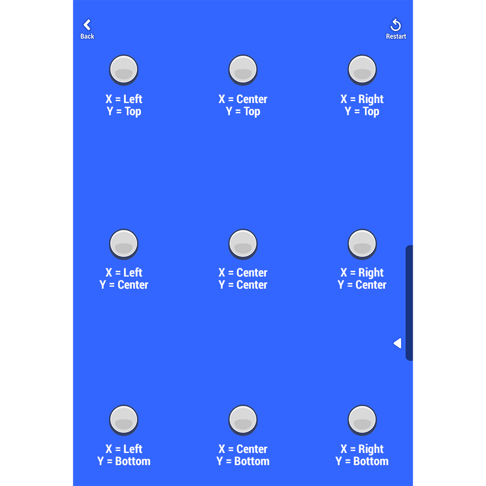
Buttons can be placed in 9 different positions on the screen using the Align Y and Align X parameters.
¶ Parameters
| Enabled | Enable or disable the node. Disabled nodes cannot be executed |
| Visible | Determines if the Button is visible or not. |
| Preview | Preview the Button in the Editor without playtesting |
| Disabling triggers ”On end” | When toggled on, On End output will send a signal if the node is disabled during a touch |
| Appearance | Choose between different visual styles for the Button |
| Icon | Select different icons to appear on the Button to help players understand what it does. |
| Align X | Select the horizontal placement of the button |
| Align Y | Select the vertical placement of the Button |
| Touch Area Size | Screen area in which the button listens to touches. |
| Color | Select the color of the Button from available UI Colors or create a new color. |
| Icon Color | Select the color of the Button Icon from available UI Colors or create a new color. |
| Description | Select between preset descriptions or define a custom text that will appear on the Button. This helps players understand what does. |
| On Start | This output sends a signal or a value when the Button is pressed |
| On End | Sends a signal or a value when the Button is released |
| On Down | Sends a signal or a value continuously when the Button is held |
Buttons appear in one of 9 preset screen locations based on the screen dimensions of the player's device. If this is not enough for your game, you can create custom buttons with the User Interface Node.
A short summary of the Button node:
https://www.youtube.com/shorts/Hb-uZtN9rhk?feature=share
¶ Learn about This Node
In this segment from the weekly HypeHype Live Shogun demonstrates Controller Mapping feature which allows you to customize your game's controls for all platforms: