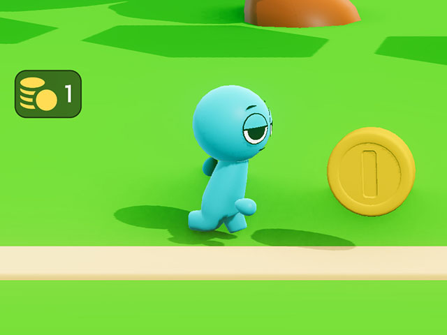
¶ Heads-up Displays (HUDs) in HypeHype
A HUD (Heads-Up Display) is a critical part of most games—it provides players with essential real-time information without interrupting gameplay.
Examples of HUDs include timers, health / xp / stamina bars, quest objectives, ammo counters and shield status bars.
This tutorial walks you through building a simple HUD with a total score display.

¶ How to Make a Score Display
¶ 1. UI panel and layout
- Add a UI node and give it a name.
- Open the UI editor
- Drag a panel to the scene
- Align the panel to the top left corner
- Change the color: Properties > Color > Alpha 50
- Drag a Horizontal layout inside the panel
- Align the horizontal layout to fill the whole panel
¶ 2. Add the image and text
- Drag an image to the scene
- In Properties:
- change image width and height to 60
- tap the image icon and choose a fitting image
- tap the image color and change it - Drag a text to the scene
- In Properties:
- Change the name of the text component to money
- change the value of the text field to 0
- toggle off outline
¶ 3. Adjust content position
-
Tap Hierarchy > Panel
-
In Properties, toggle on Use Content width and height
-
Tap Hierarchy > Horizontal layout
-
In Properties:
- toggle on Use Content width and height
- set the left, right, top and bottom margins
- set the spacing of the elements
¶ 4. Connect the data
- Tap Hierarchy > Text > Inputs and Outputs > Value toggle: On
- Exit the UI Editor and add a new asset: Assets > Premades > Collectable Score
- You can check which broadcasting signal the collectable sends by tapping Details > Collectable Score > Edit > Get Score Broadcaster
- Add a new node: Logic > Add node > Meta > Broadcast listener
- make sure the listener listens to the correct signal, in this case: Get Score - Drag a link from Broadcast listener's On signal received > UI node's input
- Convert the link to a setter link. Change the operation to Add. Toggle off Also execute.
- Playtest!
¶ Summary of the example
This UI is built with nested elements: a panel contains a horizontal layout (for side-by-side positioning), which holds the image and text.
The panel is aligned to the top-left corner to ensure proper placement across devices. The horizontal layout is set to fill the panel, allowing access to margins on all sides. Note that the alignment settings affect the available margins. The Use content width/height option lets the panel and layout resize automatically based on content.
Both the UI and text field are named for easier identification, especially when working with multiple UIs.
Other edited properties include color, outline, and image/text size. You can adjust opacity too — e.g., the panel uses a semi-transparent Alpha 50 color.
The UI's look, position, and content can change during gameplay. Here, the value input of the text field was enabled so it can update as the player collects coins. Check the Inputs and Outputs menu in the Properties panel to explore what can be changed dynamically.
¶ Final Tips
- Use consistent styles for borders and fonts across HUD elements.
- Keep HUD components positioned with screen alignment and size scaling in mind for different devices.
- Consider testing the UI in multiple aspect ratios to ensure it looks good everywhere.
With just a few nodes and smart UI design, you can build clear and functional HUDs that elevate the player experience in your game. Try customizing colors, icons, and animations to fit your game's aesthetic!